As previously mentioned, I decided to go with the below inscription to work on as a reference:

I began working on the typeface, as you can see below:
I started with the O, which appeared to use classic proportions for capitals (using some 'square' characters, and others rectangular)


After creating the 'O' the width and height of my curved characters were defined. These were noted down within glyphs:

As you can see, after creating the 'E', the weight of the vertical and horizontal stems for the straight characters were also defined.


Limited to certain characters that were designed, only a few examples could be used....

From the above example, it's clear that the horizontal stems needed to be thickened. I also realised that although I liked some of the quirky characteristics of the inscription, some of them take away from functionality.
Making Initial Changes
Below you can see the overall changes made to the first few characters:

As you can see, the proportions have been changed to something more modern. This is because I wanted to emphasise the idea of bringing something classic to a digital era. I still want to include some of these quirky characteristics, but I think these can be added as alternative characters.
C Changes: Slightly heavier horizontal thickness. The serif was also changed with a 'wedge' added for stability.

E Changes: The central stem has been positioned more evenly spaced. Serif's have been adapted from a curved into a more 'slab serif' form.

G Changes: Slightly thinner, more modern proportions. Serifs made into a more 'slab serif' form.

O Changes: Proportions have been modernised, and a less contrasting character.

Adding More Characters
With proportions and weights defined, it was easy to consider more characters.

I decided serifs were important on top of the A, and should be slightly more exaggerated in comparison to the reference. I think the serifs on this typeface are it's more obvious characteristics.
I increased the size of the inner serifs, to compensate for the white space that was created:

The B was based on the E, but with a more centred crossbar. It has also been made slightly thinner, to compensate for the space taken up by the bowls in comparison to the E.

The D is quite simply the combination of the C and E.

The F was easy to create, as it's very similar to an E.

I was the easiest character to work on, with the vertical thickness already defined.

K is always difficult to work on, working out where each bar connects. I originally created something quite centred, but then favoured the two bars meeting closer to the height of the E crossbar.


L was created in reference to I's serifs, and E's bottom crossbar. The bottom serif was made slightly longer to compensate for the white space.

Originally, the P's lower crossbar was similar in height to the F.

This height was changed significantly lower, to free up some more space for the bowl.


Comparing letters in use is essential when designing type, to consider how evenly weighted and consistent that characters look. This can be seen below:

Designing the Q in reference to the O, quite a simple procedure of adding a stem. I added quite a large stem, in reference to some classic typefaces like Trajan (roughly 1900 years old). I was considering adding another alternate Q character as a swash, with a similar form to Trajan's.

Trajan:
Example of use:

The R was fun to create, taking the form of the P, but adding some of the Q characteristics.

I was going to leave most of the diacritics to my collaborators, but I couldn't resist adding a Thorn, essentially the combination of an I and P:

Some quick punctuation:

Another example of usage:

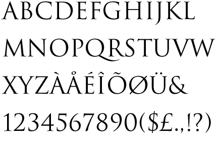
Current Progress

Completed Characters:
A, B, C, D (screenshot is slightly old), E, F, G, H, I, J, K, L, M, N, O P, Thorn, Q, R T U