Creating Alternate Characters
One benefit of the OpenType & Unicode is the allowance of alternate characters within the same font file. I wanted to include some Victorian eccentricities within the typeface, which you will see below.


Experimenting with an A with a diagonal crossbar:


Experimenting with an R with an elegonated tail - I chose to remove this as I felt it did not work.


A selection of alternate A's:


Trying out an alternate crossbar for the B:


A curved crossbar in the H, to match the A:

After discussing the height of the central bar for the E, I decided to include two different options, one as an alternative:

The E crossbar doesn't line up anywhere near the A, which is the same for the H alternative. However, I quite like the imperfect look it offers. The original inscriptions had these imperfections, and I think it would offer a unique way of working with the font:


The original inscription had an O with classic proportions, which was taken away for consistancy. However I liked the idea of including it as an alternate character:

Adding Punctuation
Obviously to create something usable, punctuation is needed. Here are a few characters that were added.
Asterisk:


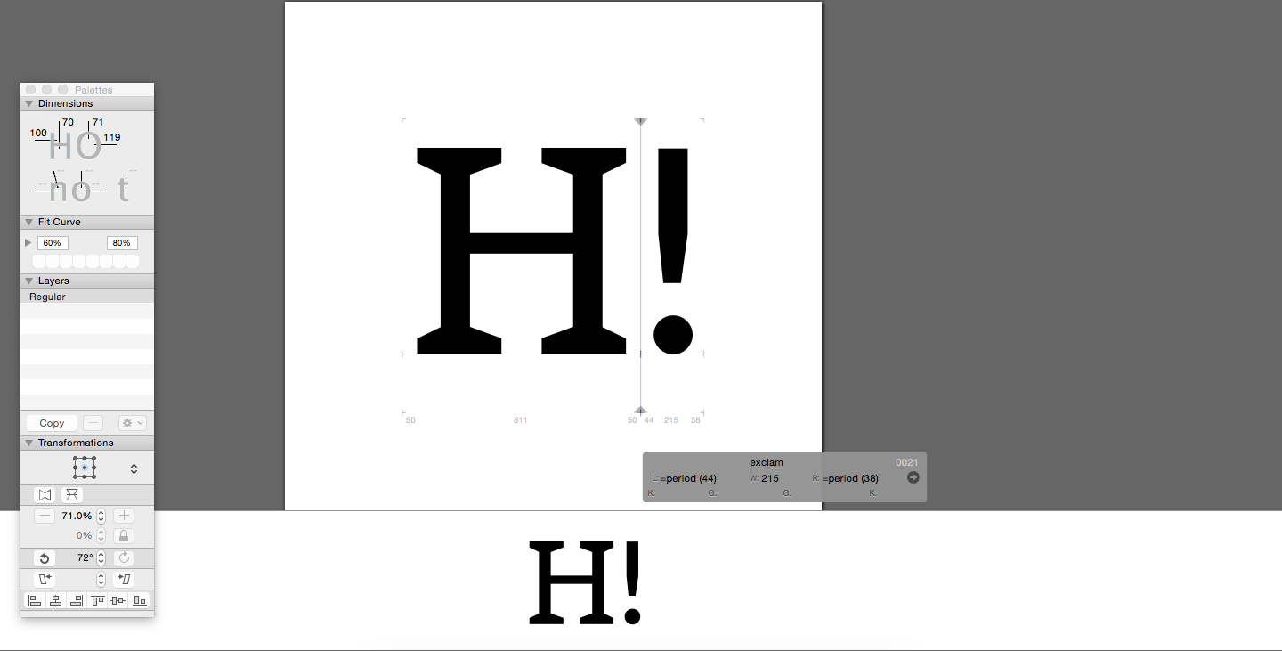
Exclamation mark:

Colon:

Em dash:

Colon:

Quotation marks and a comma:

Unique Characters
I thought it would be fun to create a 'alternate character' that showed where the font had been designed. For example, if the user types 'UK', 'CZECH' or 'AUSTRIA', a silhouette of that country could also be used.
Although this is quite a fun idea, I thought it would be entirely useless, so was later dropped.


CZECH:


AUSTRIA:

All three together:

Back To Some Alternate Characters
Below I experimented with a different W, but I felt the double central serif's added too much weight to the character, which would look even heavier at small scale.


I also worked on a similar but alternate option:

An alternate Q, with a larger swash:


Creating Some Numerals
After Marsi had created a beautiful 5 and 7, I had some weights and proportions to work with.
Below I created number 1:


Number 2, using Marsi's '5' Serif:


Creating an 8 is always difficult, at this stage it felt too heavy in comparison to the other characters:

Working on the 6 and 9 - These used similar propotions to the 5. However serifs were not added as they seemed to make the shape appear too heavy. I am still contemplating adding them though...


Ornaments
Inspired by 'Hoefler Text', I thought it would be great to add some ornamental characters.
Below you can see an idea I had for a border:


Another border design:


What should I add as corner pieces?

Another ornament, which I worked on symmetrically:


Working on another ornament, this one a lot more detailed with flourishes:


From the previous ornament, I could create some corner pieces:


This helped when creating much more basic forms:


Ensuring the design fits into a box:

Some quick tests:


As you can see, some of the flowers stem is too thin and detailed. For this reason I made the form simpler and thicker.


A simple, yet fun, circular ornament:


This was experimented with in a negative colour, but I feel it didn't work.
