Adding More Borders
Below I've played around with more borders:


I was not sure how to end the corner of the leaf pieces, so tried a few ideas:


I settled with a simple connecter:


To create symmetry, I worked on a quarter to the tile at a time:


An inverted option too:

From the above form, I managed to create quite a detailed divider:


A more geometric pattern:


I used the previous flower to create another pattern:

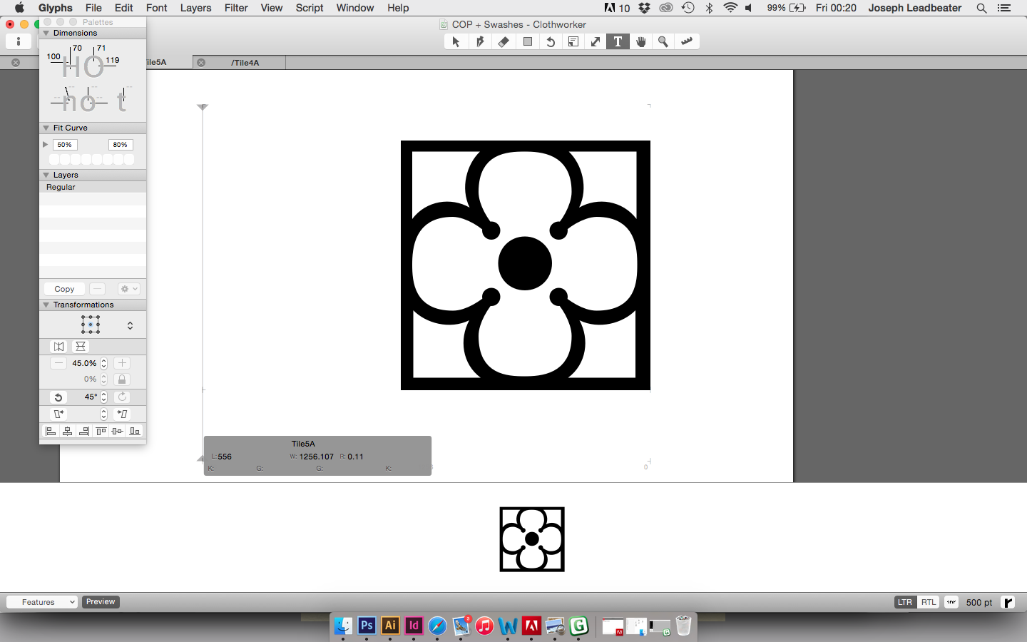
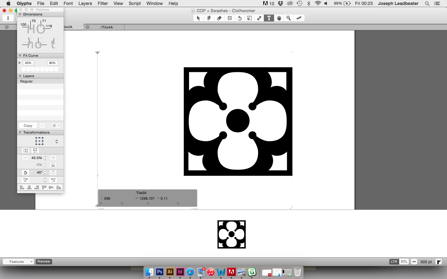
I felt the below design was too light, so the corner pieces had their size reduced...

Marsi had already added a pound symbol, but I wanted to ensure the font could be used globally, so other symbols were added.
A Yen sign was easy to create:

The Euro sign is a C with added bars, and a decreased overall width. The stem was thickened to compensate for this reduction.

A dollar sign was added, with sharp ends to the stem, to give some character seen in the exclamation mark and question mark.


A Baht sign was composed of a B, with the dollar sign's added stem:

The Peso symbol used the same bars as the pound sign, but higher.

A Kip was also added, as a modification of a K:

A cent sign was added as a reduced c, with extra stem width to compensate:

A currency symbol:

I added more mathematic symbols so that the maths set could be used more.


I began by attempting to create an ornate ampersand.


After lots of adjusting, I felt this did not work and was too top heavy.

I reduced the serif, and felt this option is much more successful, something I am really proud of.


