Adding Ligatures
After researching into classic, capital ligatures, I've added those you can see below:
The below ligature uses a smaller I, but maintains the same width of the L's stem.

I created something similar for RE.

I experimented with using the I in a TI ligature, but felt it did not work when the smaller letter is positioned on the baseline. For this reason, it was removed.

A TT ligature - the width between the T's was reduced to compensate for the space created.

A NT ligature was easy to create.

I noticed the R and the A get close, so created a ligature to match:

AN FI ligature was also easy to create, using an extended crossbar.

The same width was used for an FL ligature.


After Jan had produced the AE ligature used in French and other languages, the A form could be used for characters with a vertical stem on the left hand side. This can be seen with the AR ligature below.

The same was produced with AD:


An OO ligature is simply the combination of the two characters:

ET used the same width crossbar as with TT:


Just like OO, a DO ligature was produced by just combining the characters:

The same with OG:


The same for OC:


I experimented with the below HT ligature, but felt it was too confused, and could be read as "IT":

So it was deleted:

An HE ligature that uses the H's stem:

An NN ligature that uses one of N's stem:

A UT ligature which will either be removed or worked on more. The characters feel way too close.

Adding Pinyin Characters
Pinyin, or Hanyu Pinyin, is the official phonetic system for transcribing the Mandarin pronunciations of Chinese characters into the Latin alphabet. I only needed to add a few characters to my typeface to make it usable in Pinyin, so I couldn't resist.


Creating Fractions
When adding numerators and denominators, the characters are not simply scaled down. They are still thinner than their larger counterparts, but need to have some added thickness to work at small scale. Below is the process of changing these.


Adding thickness to the 7:


The full set:

As well as the characters themselves, common fraction combinations have their own separate characters. Below I have considered the spacing when interacting with the fraction sign.

Originally the percent sign composed of two zeros. However, I felt these were too large and used a more circular form for both the percent sign and the per thousand sign.


Per thousand sign:

Creating Tabular Figures
Tabular figures are used when gridding numbers. The characters are monospaced, so decimal marks line up properly:

These are simple to create, as it's simply adjusting the metrics. I used the width of my widest number (0) with its lining figure spacing to work out a width of 600. This was applied to the rest of the numbers to give an even spacing.


Finishing the Latin Alphabet
I had put off designing the X and Z for a while, as they're difficult to design. However I needed them completing, so here they are..
I consulting Karen Chang's book 'Designing Type' which helped with proportions.
As you can see, the X takes a similar width to an O, with the bars not actually connected.


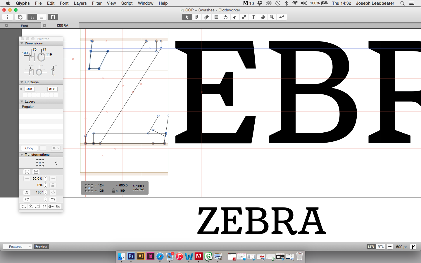
The Z takes some of the characteristics from the E, with a thin-thick-thin form.


More Ornaments
I added more ornaments, using the same 700 x 700 scale to fit them in.


Experimenting with the tiles in InDesign:


A circle was added to create more of a corner piece.

I tried a different corner shape, but I found this to be strange...

How the tile works as an overall border:


