More Alternate Characters
Since the original inscription works as a form of signage, I thought it would be fun to create some street sign characters.
Initially, it seemed the easiest answer is to simply create scaled down characters. However these appear too small and inconsistent. The answer was to scale the character down, and then add more weight more weight horizontally, but maintaining almost the same character width. This obviously is much easier with characters with bowls (like the A in AVE), as these can simply be reduced in size.


After doing some research on quirky Victorian characters, I noticed a few had dots in the centre of the bowls. The characters with bowls (like the D,O, etc.) have been a struggle to create interesting alternates for, so this works perfectly. I used the period character to create these, in order to maintain the typeface's consistency.


A curved bar for an alternate N:

Adding Punctuation and Mathematic Symbols
The question mark was composed of the exclamation mark and the serif from number 5.

Mathematic symbols used the same weight as the H crossbar:

Brackets were easy to add:

Creating the three was challenging, as I wanted it to maintain some of the other numeral's proportions. I began by combining a 7 and a 3, which was then tweaked.


The four was created optically, since I had no other numbers to reference from.

Experimenting With Old Style
Many fonts with classic roots offer old-style numerals. I wanted to see if I could add them to the typeface, but I was worried that the low contrasts and proportions of my numerals simply wouldn't allow it.
Only a couple of the characters are redesigned for old style numerals, the rest are just positioned differently.

The 5 is at x height:

The same with the 3:

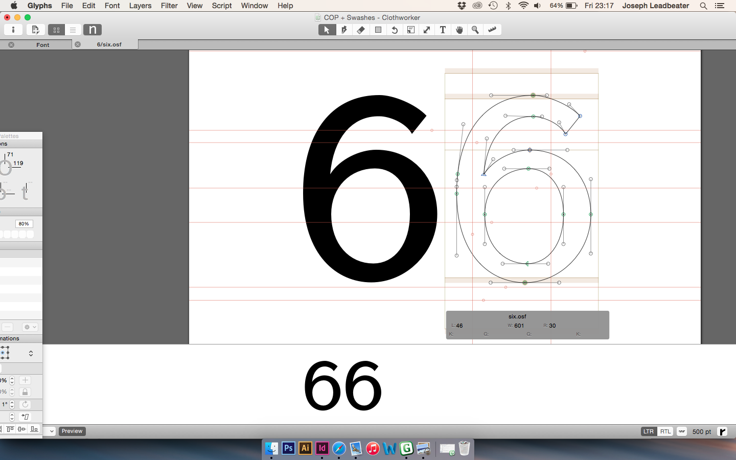
6 stays the same height:
9 is at x height:

8 stays the same height:

7 is at x height:

4 is at x height:

The 2 needs to be the height of the x height, from the baseline. I

The characters together - I felt either I was not experienced enough to add the characters, or they simply did not work.

Deleting the characters from the set:

Editing Font Information
Obviously I wanted to credit all the people that have helped with the typeface, so I added them as designers under the font information.

