Since my design is classic and pre-digital, it would be best suited with a classically designed specimen. I've researched into pre-digital specimens to get an idea on how a typeface can be showcased.
I like the idea of creating an ornate border for the front cover:

A very simple way of communicating the basic Latin characters:

I like the border shown below, and am considering framing each page:

The way the paragraph symbols have been shown at different point sizes below is very visually stimulating.

Obviously the best way to show a pattern is within it's use, not just as a single tile. This is shown well below:

The recurring theme of using ornate borders:


Examples of borders in use:

Again, borders have been used on each page:

Borders have been used with the companies name below:


I think the below options work really well to showcase a border selection. Not only have horizontal and vertical pieces been shown, but by creating a corner you can showcase the corner of a border. I also like how each individual piece is displayed next to the patterns.


The ornaments have been used well as dividers below:


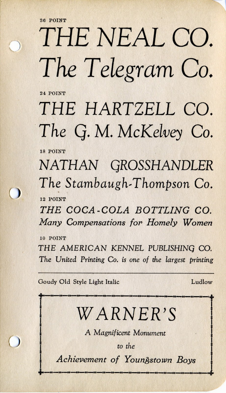
There seems to be a distinct way of showcasing point sizes, with the largest often at the top, and decreasing in size as the characters displayed are lower on the page.


Characters also seem to be organised well, with an obvious cataloguing system:

A great way of showcasing smaller numerals:

The way the characters have been gridded below work well. The characters themselves getting small guides the eye well, whilst the pt size is aligned to aid understanding of each characters size.

The same idea of the largest pt size at the top, decreasing in size.

I really do like the below layout. Information can be displayed close to the spine so it does not distract the eye from the typeface itself. Furthermore, the use of lines to split up each point size is simple yet effective.


A similar layout of illustrated point size as above, but this option has the point size illustrated on the outside of each page.


I feel the below layout option could work really well with my specimen. It is non-distracting and gives great visual symmetry.

